When the territory becomes the typeface: what Amazonia's new identity gets right
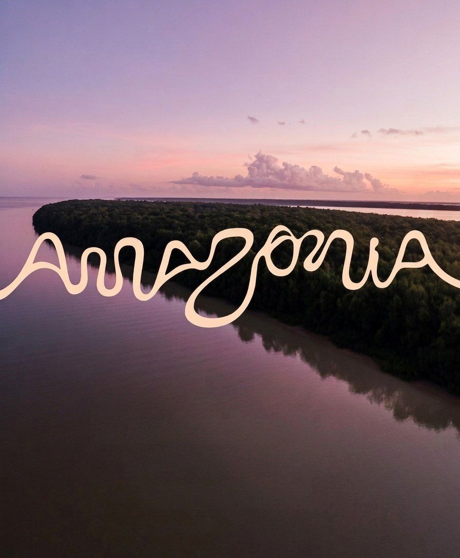
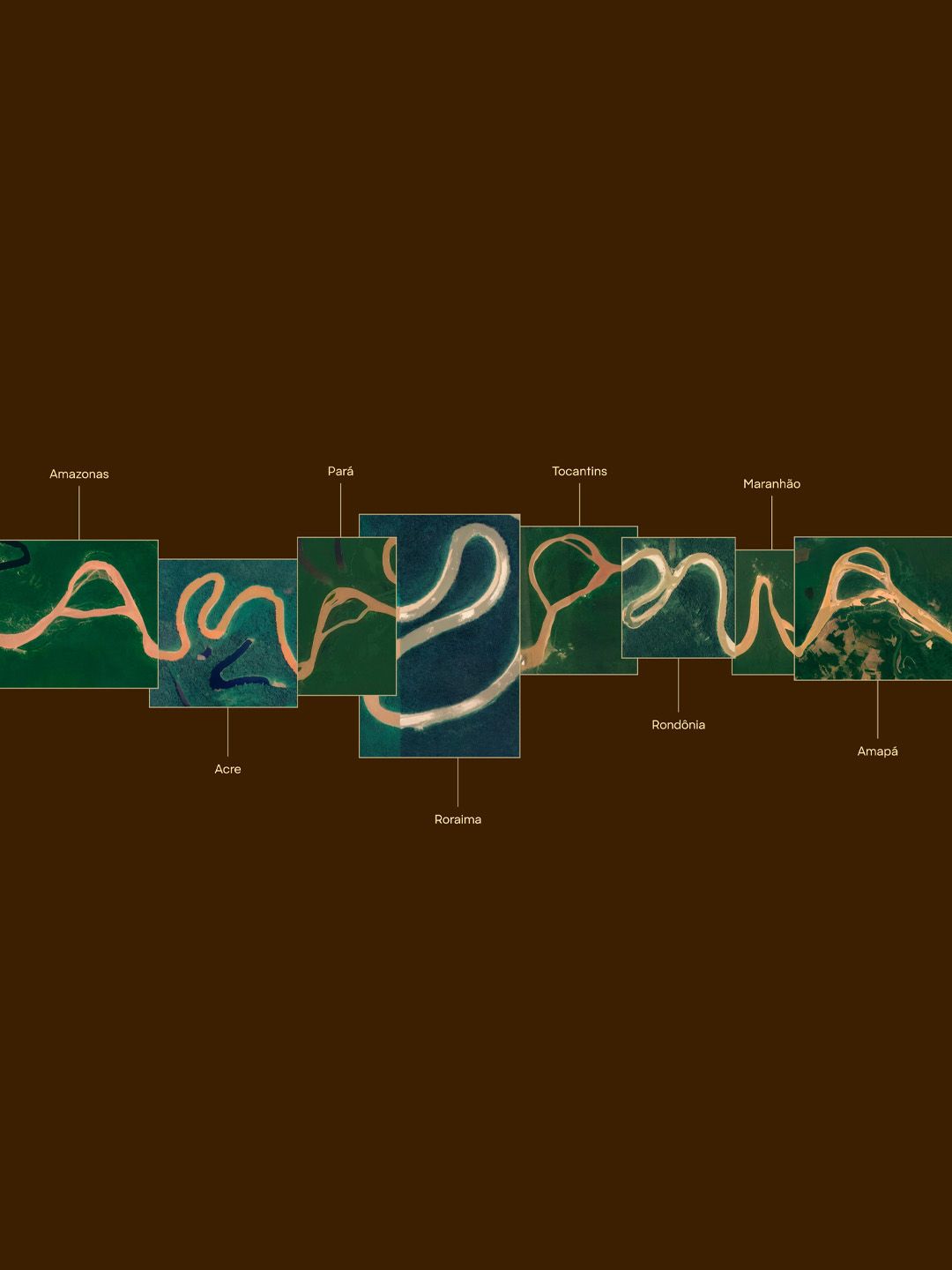
Brazil's new visual identity for the Amazon region did something most branding doesn't attempt. It derived its entire typographic system from the actual geography of the place, 25,000 kilometres of rivers translated into letterforms. The result is a brand that doesn't describe its territory. It is made of it.
In 2026, amid one of the most saturated periods of global rebranding, Brazil unveiled a new identity for the Amazon region that managed to do what almost no rebrand does: stop people mid-scroll and generate genuine conversation. Not because of a controversy. Not because of a celebrity campaign. But because the design itself was undeniably, almost inexplicably, right.
The team behind it studied the river network of the Amazon basin, one of the most complex hydrographic systems on Earth, and used its curves, confluences, and flow paths as the literal source of a custom typeface. Every letter is, in some meaningful way, a river. The geographic data became the creative brief. The territory wrote the type.
What makes this worth examining isn't the technical feat, although that's real. It's the strategic clarity behind it. At a moment when every major brand seems to be racing toward the same destination, flat logos, monochrome palettes, geometric sans-serifs, the visual language of "clean" and "modern", Amazonia went in the opposite direction without rejecting modernity at all.
The brief was already written. It just needed someone willing to read the landscape.
The result is something no other brand can replicate. Not because it's legally protected (though it is), but because it's geographically specific. You cannot have the Amazon typeface if you are not the Amazon. That's a form of brand equity that no budget can manufacture. And that's why thousands of people shared, discussed, and admired it without a single dollar of paid promotion behind the conversation.
The luxury and premium space has a persistent temptation: modernise. Stay relevant. Simplify. And often, that instinct leads brands to sand down exactly the details that made them irreplaceable. A heritage watchmaker flattens its logo. A regional food brand loses its dialect to speak to a "global audience". The result is a brand that looks contemporary and means nothing.
Amazonia is a useful counter-argument. It didn't treat its origin as constraint to work around. It treated it as the most powerful asset it had. The identity didn't borrow from what was trending. It mined what was already true, what was sitting right there, 25,000 kilometres of it, visible from above.
The most defensible brand identities aren't the most polished. They're the most rooted. Provenance, when it's genuine and visually encoded, not just narrated in a brand film, becomes something competitors simply cannot access.
Thousands of people shared, debated, and admired this identity without being prompted by an advertising campaign. That kind of organic reach doesn't come from a clever concept. It comes from a design that makes people feel something they can't quite articulate, the sense that this could not have been done any other way.
That's the standard worth chasing. Not the most modern. Not the most minimal. The most inevitable.